Welcome to my deep dive into a full-scale, end-to-end data engineering project built on Azure cloud service using the NHS English Prescription data.
The inspiration for this project came from a common realistic challenge: accessing and making sense of large, messy, and distributed healthcare data. The NHS Business Services Authority (NHSBSA) makes publicly available a monthly feed of prescribing activity in England; an incredibly rich source of data, but not exactly “report-ready.”
What I wanted to do was create something from scratch that could:
-
Pull this data automatically from the web,
-
Clean and structure it properly in the cloud,
-
And finally, use that data to tell compelling stories through business intelligence tools.
This post walks you through how I achieved just that using Azure Data Factory, Data Lake Gen2, Synapse Analytics, and Power BI, with nothing but open government data, SQL, Python and my API knowledge.
The Challenge: Taming Public Healthcare Data
The English Prescribing Dataset (EPD) is published monthly by the NHSBSA and contains millions of rows of data per month. Each file is published as a unique resource_id via an open API, and includes detailed fields like the prescribing region, the practice, the drug name and code, quantities, and costs, everything from paracetamol to high-cost cancer drugs.
But here’s the twist: even though the data is open and the API is free, it is not designed for large-scale querying or analytics. The files themselves often return as CSV files with all columns crammed into a single string field. Each month has to be requested separately, filtered with SQL, and stored somewhere, none of which is ideal for data scientists or analysts.
My goal was to create a fully automated cloud pipeline that could handle this data from end to end.
WORKFLOW
Step One: Ingesting the NHS Data with Azure Data Factory
The first major component of the project was building a dynamic ingestion layer with Azure Data Factory (ADF). ADF allows you to visually design and automate pipelines that move and transform data. In my case, I used it to call the NHS API repeatedly, once for each month, across a four-year window from 2020 to 2024.
Here’s what that looked like:
-
I built a REST-linked service that points to the NHS API.
-
Then I created a parameterized dataset that accepts
resource_id,pco_code, andbnf_chemical_substanceas parameters. -
I passed a dynamic SQL query (encoded into the API URL) that filters the raw data before even pulling it down.
All results were saved into Azure Data Lake Storage Gen2 as raw .csv files. The directory structure organized the data by year and month, perfect for downstream transformation.
And just like that, we had raw prescribing data from four years of NHS records, filtered and structured but not yet clean.
Step Two: Cleaning the Chaos in Synapse Spark
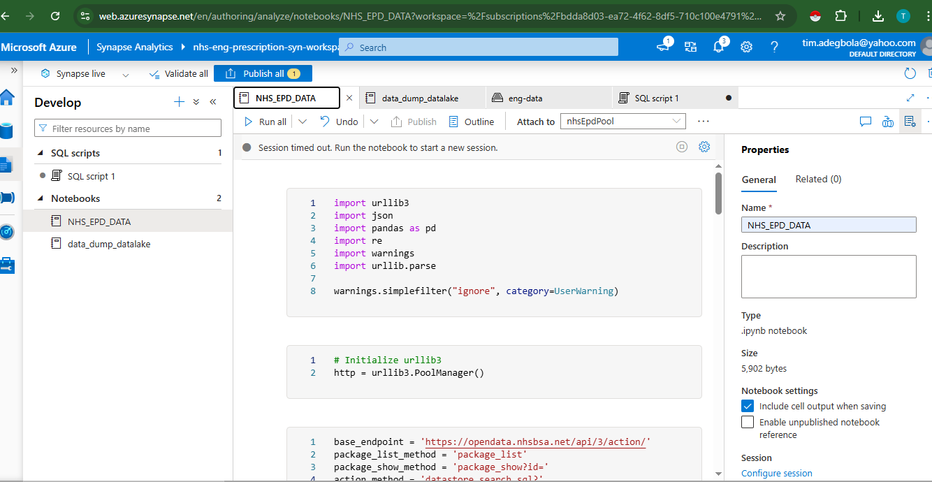
Once the data landed in Azure Data Lake, I quickly ran into an issue: each CSV file was basically a string dump. Instead of neatly formatted rows and columns, I had one giant column with comma-separated text.
This is where Azure Synapse Analytics (specifically, Synapse Spark Notebooks) came into play. Synapse let me run distributed Spark jobs right from the browser, using PySpark, to clean, normalize, and enrich the data.
The logic was simple:
-
Read the raw CSV as a string column.
-
Use
split()andselect()to divide it into individual fields. -
Rename and type-cast each field properly, including numeric conversions for costs, integers for quantities, and date logic for timestamps.
-
Create new columns for
Year,Month,Cost per Item, andCost per Quantity.
This cleaned data was then written back into the clean zone of the same Data Lake; this time as Parquet files for better performance and schema-awareness.
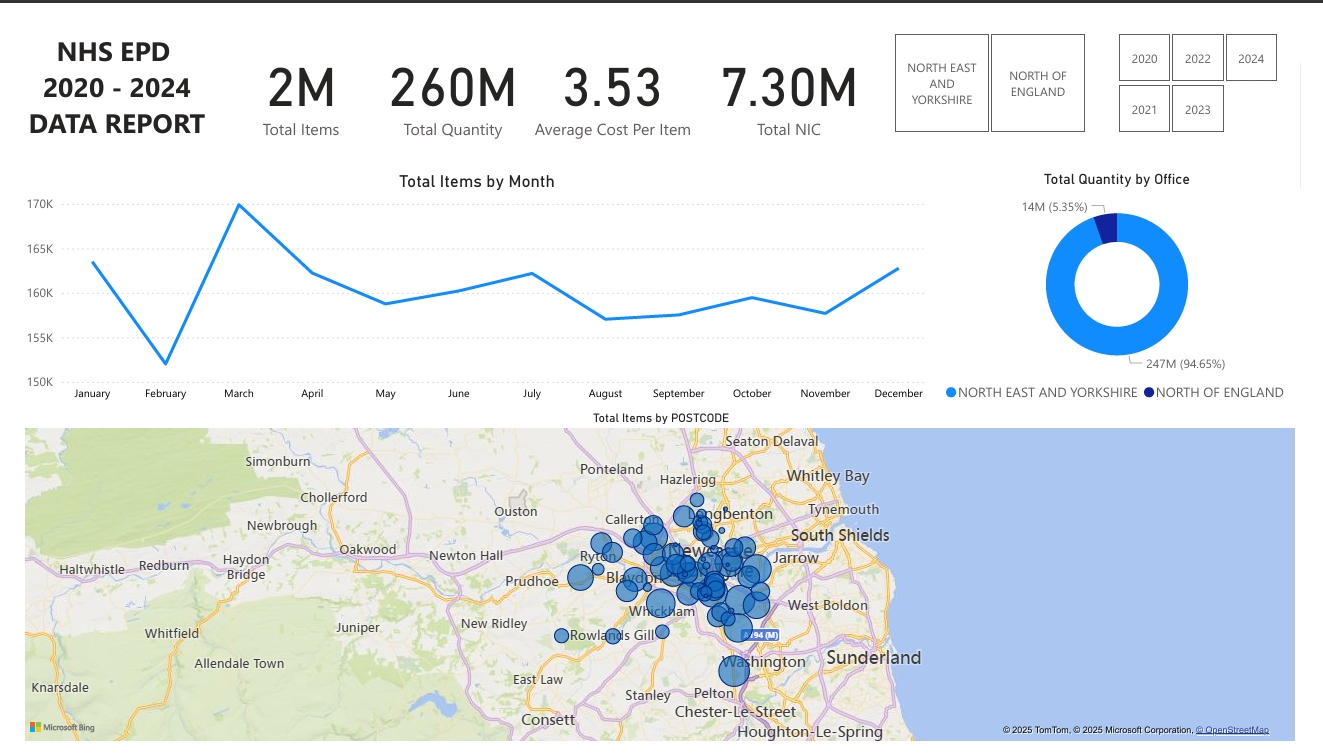
Step Three: Visualizing Insights in Power BI
Now came the fun part: turning this clean, structured data into stories.
With the cleaned data in Parquet format, I connected Power BI directly to the Azure Data Lake using either:
-
Direct Lake (via ADLS Gen2) or
-
Synapse Serverless SQL with views
In Power BI, I created a full suite of interactive visuals and KPIs to explore prescribing behavior across England.
Some of the highlights included:
-
Total Items Prescribed, Total Net Ingredient Cost, and Actual Cost; all as summary cards
-
A line chart showing trends over time, revealing seasonality in certain prescriptions
-
Map visuals showing the total items by postcode across England
-
Dynamic filters for year, month, region, chemical, and postcode
All these dashboards were built with DAX-powered measures like:
Total Actual Cost = SUM('NHS_EPD_2020_2024_DATA'[ACTUAL_COST])

Cost per Item = DIVIDE([Total Actual Cost], SUM('NHS_EPD_2020_2024_DATA'[ITEMS]))
Chemical Rank by Cost =

RANKX(

ALL('NHS_EPD_2020_2024_DATA'[BNF_CHEMICAL_SUBSTANCE]),

[Total Actual Cost],

,

DESC,

Dense

)
Cost per Item = SUM([ACTUAL_COST]) / SUM([ITEMS])
Average_Cost_Per_Item = DIVIDE(SUM('NHS_EPD_2020_2024_DATA'[ACTUAL_COST]), SUM('NHS_EPD_2020_2024_DATA'[ITEMS]))
These formulas gave me the flexibility to compare cost-efficiency between drugs, regions, and years with real business impact potential for healthcare planners or budget analysts.
Final Pipeline Architecture
Here’s a visual summary of the project workflow:
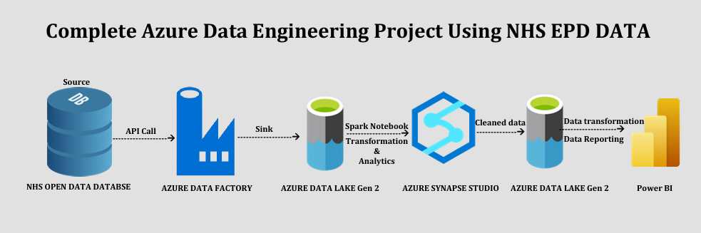
Each component plays a critical role in moving from messy public data to business intelligence.
Lessons Learned
Building this project taught me so much more than just Azure tooling. It showed the importance of:
-
Designing for data quality from the start, especially when working with public APIs.
-
Embracing modular architecture, separating ingestion, transformation, and analytics layers.
-
Using the right tools for the right stages like ADF for movement, Spark for cleanup, and Power BI for storytelling.
-
And perhaps most importantly, creating a system that can automate insights at scale.
This pipeline is now fully reusable. I can add future months, new filters, or additional metrics and everything updates dynamically.
What’s Next?
While the core pipeline is complete, there’s plenty of room to expand:
-
Automate monthly ingestion using triggers in ADF.
-
Add new APIs for hospital or drug cost benchmarking.
-
Connect the dashboard to live NHS Open Data with refreshable datasets.
-
Share the Power BI dashboard publicly as a health transparency tool.
Want to Build It Yourself?
You can try it all using free Azure services and public data.
-
NHSBSA API Docs: https://opendata.nhsbsa.net/
-
Full GitHub Repo: https://github.com/timadeg
-
Power BI Dashboard (coming soon…)
If you’d like help building your own healthcare dashboard or scaling a public data project, feel free to reach out!